Finally Microsoft released most awaiting Windows 8 Officially. I’m waiting for it from last 5 months. I installed Windows 8 Developer preview on the early weeks of March 2012. After seeing its User interface I’m really attracted towards windows 8. But many things in developer preview are still under construction, so I shifted back to Windows 7. From that day I was waiting for the Windows 8 official release. At last the day came. I bought it for just $13 and installed it again on my PC. Almost everything looks awesome when compared to Windows 7. User interference has completely changed in Windows 8 and also it looks different and awesome. This Windows 8 looks similar in both Desktops and mobiles. Windows 8 is trending now on because of extra features and even due to removal of some old options, when compared to Windows XP. So, I recommend thinking twice before upgrading to Windows 8. Let me compare some main features what’re added or removed in Windows 8.
Windows 8 vs Windows 7
1. Start Menu
Start Menu has completely changed in Windows 8 Operating system. Till now we have seen a small popup on the left hand side whenever we click on the Start button. But it changed a lot in new Windows 8. You have to forget this popup and enjoy full screen interference. Yes, Full Screen, Now Start menu occupies the entire screen instead of a small size popup
The Good:
Awesome look and Easy handling of all installed softwares at single place with good looking icons
The Bad:
Little bit confusing. At this time your desktop may look like a Windows mobile and sometimes difficult to Navigate
Winner:
Tie
2. Start Button

I think you’re seeing the start button on all versions of Windows OS. But now it has gone. In Windows 8 Start button is hidden on Left-Bottom. To access the Start button in Windows 8, you have to make use of your Windows key in the keyboard or else you have to take the cursor at the lower end of the screen.
The Good:
It makes the screen simple and clean
The Bad:
Newbies may get confused with this Start button
Winner:
Windows 7
3. Aero Flip 3D
Aero Flip 3D is a popular feature in Windows 7 and Windows vista. Many people including used this Flip 3D (Win+Tab) to flip between opend windows easily. Moreover it looks simply super in style. But in Windows 8 this Aero Flip 3D is replaced with the Modern UI App Switcher. Though the Function of these both things are same, but the only difference is in style. In Windows 8 it looks simple when compared to Windows 7. It shows all opened windows on the left side of the screen when you press Win+Tab
Winner:
Windows 7
4. Backup and Restore
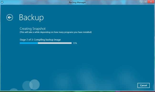
All users may backup their entire files using Backup tool. But in Windows 8 it was replaced with File backup. Backup option and File backup are same in behavior but only difference is in the name. Apart from name, new options are added in this File backup
The Good:
Our data is more safe in Windows 8
Winner
Windows 8
5. Internet Explorer
First time I’m saying Internet Explorer is rocking. Yes, trust me IE is looking great in Windows 8. You can see the latest version of Internet Explorer in Windows 8. IE 10.0 has been released and I guess it can become competitive to Mozilla Firefox and Google Chrome.
The Good:
From now Internet Explorer is not an optional browser on your system. Everything is perfect in IE 10 and you can use it tension free.
Winner:
No doubt Windows8
6. Desktop gadgets
If you’re addicted to Desktop gadgets in Windows 7 like Calculator, Calender, Currency meter etc… Then you will miss them in Windows 8. These gadgets are no longer available on the desktop. However these gadgets are shifted to Start menu. No other option, you have to go through the start menu to make use of these gadgets
The Bad:
Gadgets are mean to make our work much easier. But in Windows 8, you have to move through the Start menu to use them. So, there is no point in saving time.
Winner:
Windows 7


Windows 8 is not best according to me but windows 7 is good and have good graphics without any graphic card.
Agreed partially. But user interface is really awesome in windows 8
I am still on windows 7 and I pretty much like it but I’m pretty sure that windows 8 will or should be better than its predecessor…
not only you i had also been waiting for this but i did not like this one it did not come upto my expectation but anyways it is good to hear that technology is getting updated day by day and major enhancements are taking place in this era.
Windows 8 app store and booting time (you forget about it) is of unmatched quality and lacking in Windows 7. Microsoft engineers has done a great research on speeding Windows 8 as well as making it attractive and that’s why 40 millions of copies were sold within the first week of its release.
Great readings and useful information though which I haven’t heard about yet.
What i like most in Windows 8 is the Start up time, it starts in less than 10 seconds on my laptop. 😀
Fortunately, for most of these missing features, there’s a solution to get them back! As for Internet Explorer, I wished it was removed!
Windose 8 is still very unstable. There are a lot of bugs that needed to be fixed. so I’d better wait a couple of months and then carefully installed. loved the design!
yeah, but UI is awesome. May be we should wait for updates
great…i also installed Windows 8 Yesterday and Its Rocking But i Don’t like its Start menu….