You have a Gmail account. Say you don’t and I will call you a lier! Over the last few years, Gmail’s web interface hasn’t changed much. Although the platform allows you to customize the appearance, the default look has been the same.
You won’t have to live with the age-old design anymore. Google has sent out an email to the G Suite administrators about the upcoming redesign of the most popular email platform.
Gmail is Going to Get an Overall New Look

Maybe, you have been using Gmail for the last few years. I am sure you didn’t notice any visible changes in the appearance till then. Although Google changes the design of other services (for example, YouTube) once in at least two years, they overlooked Gmail for some strange reason.
Today’s design dates back to 2011 and even at that time, the change in appearance didn’t get a treatment they expected. Maybe, the company kept the same look for the last seven years simply because they don’t want to face the criticism.

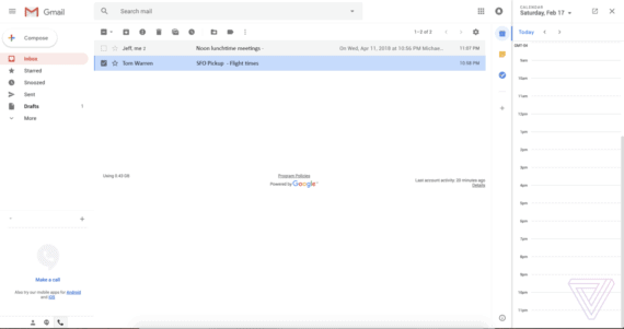
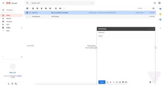
Nonetheless, they have finally decided to shift to a new theme now. Right after the company sent an email to the G Suite administrators, mentioning the upcoming ‘clean and fresh look’, the images of the changed interface have surfaced on the web.
Also Read: How to sort Gmail Inbox by the sender, subject, and labels
Not only do they change the appearance, but they also adopted a few features from the not-so-well-received sibling Google Inbox. Going by the leaks, we will see a new Snooze function on the updated interface, using which you can eliminate specific emails for a given time.

If you use Gmail on Android, you know what Smart Reply is. The platform suggests replies based on machine learning algorithm and you can send them with a single click. Gmail.com is going to get the feature by the time the redesign goes live. You will get a new area to the right of the main screen, where you can allow space for Google Keep, Calendar, or Task.
The obvious changes lie in the design department. You will see many rounded icons on the platform along with a pink Inbox selection highlight. From the image, we have figured out that the font has been changed from Arial to Product Sans (messages use Roboto font from Google).

A Google spokesperson told the media that they are working on some major changes to Gmail and they are still in the draft phase. He also added they need more time to compose themselves.
Did you check the images? What do you think about the new design? Let us know in the comment section below.

I am using it all the time and I must say that it is time for them to change it since it is just the same since I started blogging. Wonder what the changes would be.